Font Words, Plainly — Weld, Swash, Ligature, Counter, Kerning, Monoline
Six words that decide whether a font cuts. Each one defined by what goes wrong on the mat when you ignore it, not by what it means to a typographer.
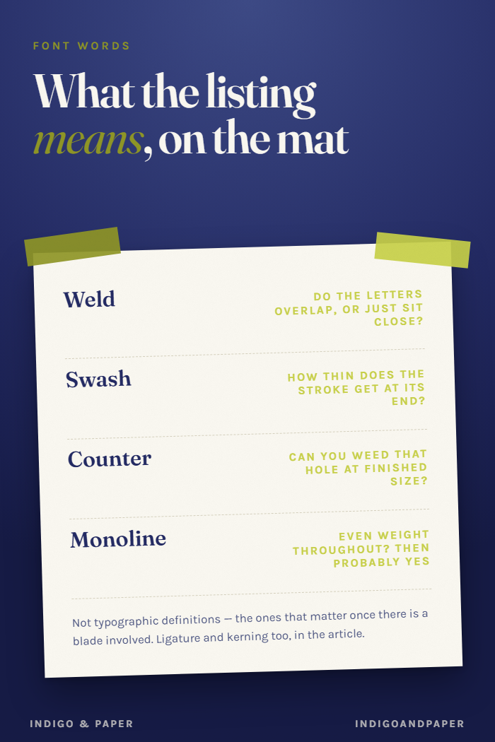
Font listings are written by people who design type, for people who set type on a screen. You are neither: you are about to send it to a blade. The same six words appear in almost every listing, and each of them predicts something specific about what the vinyl does.
These are not typographic definitions. They are the definitions that matter once there is a mat involved.
Weld
What it means: fusing overlapping shapes into one outline, so a word cuts as a single piece instead of as separate letters.
What goes wrong: weld has nothing to fuse unless the letters genuinely overlap. If they merely sit close, you get two shapes with a hairline between them, and that hairline is a real cut line. The vinyl separates when you weed it.
This is the most common "weld didn't work" and it is not a software fault. Three properties decide whether a script welds, and all three are visible in the specimen image before you pay.
Before the detail — the tracker this argument produced is free, undated and three months long. It is the shortest version of everything below.
Swash
What it means: an extended decorative stroke — a long tail on a y, a sweeping entry on a capital.
What goes wrong: swashes taper. A stroke that starts confidently and ends in a point will, somewhere along its length, become narrower than your material can hold. In vinyl that tip lifts with the transfer tape. In cardstock it tears at the weeding stage.
The practical rule is that the thinnest part of the swash, not the average weight, decides whether it cuts. Look at where the stroke ends, not where it begins.
Ligature
What it means: a single glyph replacing two letters that collide awkwardly — fi, ffl, or in scripts a purpose-drawn join between specific pairs.
What goes wrong: two things, in opposite directions. Ligatures usually help you, because a drawn join is a proper overlap and welds cleanly where the default pair would not. But they only fire if the software applies them, and Design Space's ligature support depends on the font file and has changed between versions. A font sold on the strength of its ligatures can arrive looking like a font without any.
Check by typing the pair on screen before you commit to the layout. If the join looks like two letters near each other, the ligature did not fire and no amount of welding will invent one.
Counter
What it means: the enclosed space inside a letter — the hole in an o, the loop of an e, the two chambers of a B.
What goes wrong: counters are the pieces you have to remove, and small ones are the pieces you cannot. A tight counter at small sizes becomes an island of vinyl too small to grip with a weeding hook, and it either stays put or takes the surrounding letter with it when it goes.
Scripts with small counters are the reason a monogram looks fine at 6 inches and unweedable at 2. If you know the finished size, judge the counters at that size rather than at the size the specimen shows them.
Kerning
What it means: the spacing between specific letter pairs, as the designer set it.
What goes wrong: for cutting, kerning is not about looking right — it is about whether letters touch. A well-kerned display font deliberately leaves optical space, which is exactly the hairline problem above. A script kerned tight enough to weld often looks slightly cramped on screen, and that is the correct trade.
So the font that photographs best in the listing is frequently the wrong one, and it is not a quality difference. It is the same property optimised for two different outcomes.
Monoline
What it means: a stroke of even weight throughout, with no thick-thin contrast.
What goes wrong: nothing, mostly, which is why the word is worth knowing. Monoline is the single most reliable predictor of a font that cuts. No tapering means no thin point to lift, and even weight means the whole outline is as strong as its narrowest part — which is all of it.
If a listing says monoline and the letters connect, you can usually stop checking.
The short version
| Word | The question it answers | | --- | --- | | Weld | Do the letters overlap, or just sit close? | | Swash | How thin does the stroke get at its end? | | Ligature | Does the join actually fire in the software? | | Counter | Can I weed that hole at my finished size? | | Kerning | Is it spaced to look right, or to touch? | | Monoline | Even weight throughout? Then probably yes. |
All six are checkable from the specimen image and a test cut, and none of them requires buying the font first.
For fonts built for connecting rather than for display, start in whatever script and handwritten category your font source offers — connected and monoline faces cluster there.
One thing none of these words tells you
Whether you are allowed to sell what you make with it. That is the licence, it is a separate question from every property above, and a font can be perfect on the mat and still prohibited in a shop. Four questions to ask before you sell anything covers it.