What Makes a Script Font Weld Cleanly on a Cricut
Three properties decide whether a monogram welds into one shape or falls apart on the mat. You can check all three before you buy.
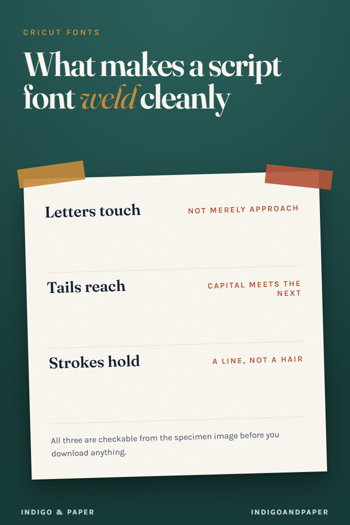
"Best script font for Cricut" is the wrong question, because the fonts that photograph well in a listing and the fonts that weld into a single cuttable shape are different sets, and the listing rarely tells you which one you are looking at.
There are three properties that decide it. All three are checkable from the specimen image before you download anything.
1. The letters have to actually touch
Weld fuses overlapping shapes into one outline. If two letters merely sit close together, there is nothing to fuse — you get two shapes with a hairline gap, and that gap becomes a real cut line on the mat. The vinyl separates when you weed it.
This is the single most common cause of a "weld didn't work" result, and it is not a software problem. Look at the specimen at the joins between letters. In a connecting script the exit stroke of one letter should visibly run into the entry stroke of the next, not stop just short of it.
Fonts described as "monoline script" or "connected script" usually pass. Fonts described as "brush" or "modern calligraphy" frequently do not, because the brush style naturally lifts between letters — that lift is the aesthetic.
2. The tails have to reach
A capital with a short tail leaves the following lowercase letter stranded, and this shows up specifically in monograms, where the capital is doing most of the work.
What you want is a capital whose exit stroke extends far enough to underline or meet the next character. In specimens this is usually shown — look for a capital with a long sweeping tail rather than one that terminates neatly at the baseline.
The workaround, if you already own a font whose tails are short, is to overlap the letters manually in Design Space before welding. It works. It is also fiddly enough that after the third monogram you will go and find a font with proper tails.
3. The thin strokes have to be thicker than your material can lose
This is the one nobody mentions and the one that ruins finished pieces.
High-contrast scripts get their elegance from very thin upstrokes. On screen that hairline is a hairline. On the mat it is a strip of vinyl perhaps a third of a millimetre wide, and it will either fail to cut cleanly or lift with the weeding and take the connection with it.
The rule of thumb, and it is genuinely a rule of thumb rather than a specification: if the thinnest stroke in the specimen looks like a hair rather than a line, size the design up or pick a different font. Monoline scripts — where every stroke is the same weight — are immune to this entirely, which is most of why they dominate cutting-machine work despite being less beautiful than the high-contrast alternatives.
Material makes a difference too. Heat-transfer vinyl is more forgiving than adhesive vinyl, and both are more forgiving than cardstock, which cracks at thin sections.
The check, in order
Before you download, look at the specimen and ask:
- Do adjacent lowercase letters visibly overlap, or merely approach?
- Does the capital have a tail long enough to reach the next letter?
- Is the thinnest stroke a line or a hair?
Three yeses and it will weld. Any no, and you are either sizing up, overlapping by hand, or picking again.
Then check the licence
Separately from all of this: whether you may sell what you cut is a licence question, not a font-quality question, and the two get conflated constantly in roundup posts. That is its own set of questions and it is worth answering before you list anything.
Where I look is the script and handwritten category, mostly because filtering by category and reading the specimens against the three checks above is faster than working through general "best fonts" lists — those are ranked by how the font looks, and looks is the property that predicts weld behaviour least well.