Why a Welded Monogram Falls Apart on the Mat
Three failures, none of them the machine's fault. How to tell which one you have from what the vinyl did.
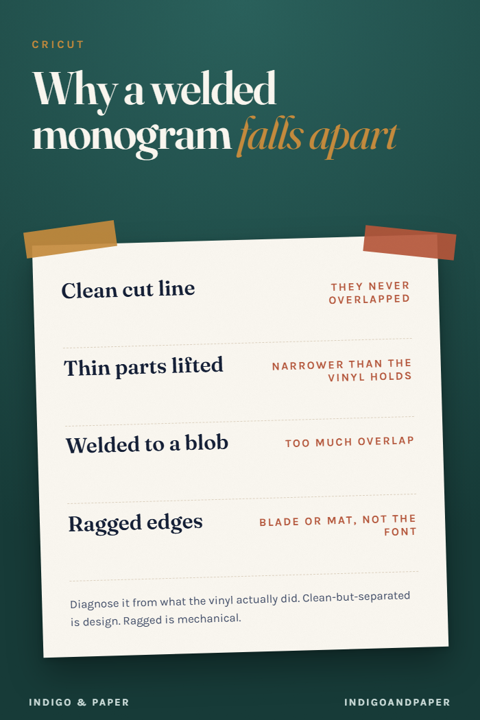
The monogram looked like one shape in Design Space. It came off the mat in pieces. This is common enough that people assume the machine or the software is at fault, and it almost never is.
Diagnose it from what the vinyl actually did.
Failure one: it cut a line where the letters meet
What you see: a clean, deliberate-looking cut between two letters. The shapes are intact, just separate.
What happened: the letters never overlapped, so weld had nothing to join. It fused the shapes it was given, and it was given two shapes that were merely adjacent.
A gap of a fraction of a millimetre on screen is invisible at design size and absolutely a cut line at cutting size. Zoom to 500% at the join and look. If you can see daylight between the strokes, that is your answer.
Fix: drag the letters into genuine overlap before welding, or use a script whose exit strokes are built to run into the next character. Manual overlap works fine for one monogram; it gets old fast.
Failure two: the thin parts lifted with the weeding
What you see: the connections are gone but there is no clean cut line — instead the thinnest strokes are missing or stretched, and there may be vinyl stuck to your weeding tool.
What happened: the stroke was narrower than the material can hold. The blade cut it correctly; it simply had no structural width, so it came away with the waste.
This is the failure mode of high-contrast calligraphic fonts, and it is a material problem rather than a design one. The same file at twice the size usually cuts perfectly.
Fix, in order of how much you will like it: size the design up; switch to a more forgiving material (heat-transfer vinyl tolerates thinner sections than adhesive); or pick a monoline script, where no stroke is thinner than any other.
Failure three: it welded into a blob
What you see: one shape, correctly, but the counters — the enclosed spaces inside letters like a, e, o — have filled in, or two letters have merged into something unreadable.
What happened: too much overlap, usually from over-correcting failure one.
Fix: back the letters off. The overlap needs to be enough that the strokes genuinely intersect and no more. If the design only reads correctly at one exact spacing, the font is fighting you.
The one that is not a font problem
If the whole design tears rather than cuts — ragged edges, the material dragging — that is blade, mat tack, or material setting, and no amount of font choice fixes it. Ragged is mechanical. Clean-but-separated is design.
That distinction is worth holding onto, because it saves you from re-buying fonts to solve a blade problem.
Preventing all three
The three checks that predict weld behaviour are the same three every time, and you can run them on the specimen image before you download anything: do the letters overlap, do the capitals have tails long enough to reach, and are the thin strokes lines rather than hairs. There is a longer version of that in what makes a script font weld cleanly.
For fonts built for this rather than for display, the script and handwritten category is where I start — connected and monoline scripts are common there, and those are the two shapes that pass all three checks without any manual overlapping.