What Size Should a Digital Planner Be?
The answer is a ratio, not a size — and getting it wrong is why your planner has black bars down the sides.
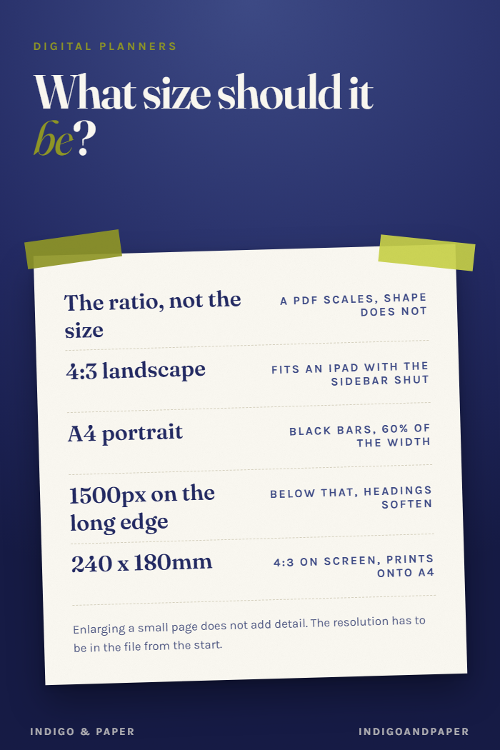
This question gets asked in pixels and answered in millimetres, which is why the answers never agree.
Here is the short version: for a digital planner, the ratio matters and the size mostly does not. A PDF is vector-and-image content that scales. What it cannot do is change shape.
Why the ratio is the whole question
Open a PDF in GoodNotes, Notability or Noteshelf on an iPad and the app fits the page inside the working area. If the page is a different shape from that area, you get bars down the sides or along the top — and the planner is smaller than the screen it is on, permanently.
The working areas you are fitting into:
- iPad, landscape, sidebar closed — close to 4:3. This is where most
- digital planning actually happens.
- iPad, portrait — 3:4, and a poor fit for a weekly spread, because a week
- laid out vertically is a list, not a week.
- Android tablets — commonly 16:10, which letterboxes a 4:3 page slightly
- at the sides and a 16:9 page slightly top and bottom.
A page drawn at 4:3 landscape fits the first, works on the second, and loses a little on the third. Nothing fits all three exactly. 4:3 loses the least.
What A4 portrait does to a digital planner
A4 is 210 × 297mm, a ratio of roughly 1:1.41, in portrait. Put that on a landscape iPad and the page occupies a tall strip in the middle of the screen with grey either side. You are then writing at about 60% of the width you paid for.
A4 is the right answer for something you will print, and the wrong answer for something you will mostly tap. Plenty of planners sold as "digital" are A4 portrait, because they began life as printables and the listing never changed. It is worth checking the preview images for the shape before you buy.
So what are the actual numbers?
Any of these are 4:3 and any of them work:
| | | | --- | --- | | 1024 × 768 px | the classic, and now low for a Retina screen | | 2048 × 1536 px | comfortable, and what most digital planners ship at | | 240 × 180 mm | the same shape expressed for print |
Pick a resolution high enough that the text is crisp when you zoom. Below about 1500px on the long edge, headings start to soften on a modern tablet.
Do not scale a planner up after the fact to hit a pixel count. Enlarging a 1024px page to 2048 does not add detail; it makes soft type larger. The resolution has to be in the file from the start.
The part nobody mentions: hyperlink targets
Size has one genuine consequence beyond sharpness, and it is a usability one. Tap targets scale with the page. A month tab that is 30px wide on a 1024px page is a small target on any screen, and it stays proportionally small however far you zoom out.
If you can, check a preview for whether the navigation is a row of tiny tabs or something you can actually hit with a thumb. That single detail predicts whether you will keep using the file more reliably than the page count does.
If you are going to print it
Then the ratio question inverts and paper wins. Choose a page that matches a paper size — A5 for something that sits in a notebook, A4 for a full sheet — and accept the bars on screen.
The awkward middle is a planner you want to do both with. 240 × 180mm is a reasonable compromise: it is 4:3 for the screen, and it prints onto A4 with a margin rather than needing to be scaled or cropped.
---
Our own 2027 planner is 240 × 180mm for exactly that reason, hyperlinked three levels deep so the navigation is a page rather than a tab strip. $14. The five checks before you buy one covers the other things worth looking at in a listing.