How to Set Up a Digital Planner on an iPad
The five settings that decide whether you use it past January, and the one that stops your handwriting being erased by your palm.
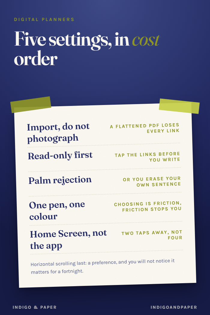
Most digital planner setup guides are a tour of an app. This is the five settings that actually change whether the file gets opened in February, in the order they cost you if you skip them.
Written for GoodNotes, but every step has a Notability and Noteshelf equivalent, named where they differ.
1. Import as a document, not a photo
Import the PDF through the app's own import — GoodNotes: + → Import, not the Files app preview, and not by screenshotting pages.
Photos flatten the file. A flattened planner loses every hyperlink, which turns a year of navigation into 68 pages of scrolling. That is the single most common way a hyperlinked planner ends up feeling like a stack of images, and the mistake happens in the first thirty seconds.
2. Turn on read-only, then turn it off
Counter-intuitive, but do it once and you will understand your own planner better.
In read-only mode, tap the hyperlinks. Find out what the year links to, what a month links to, and whether every page has a route home. Two minutes of this tells you the structure. In edit mode, a tap near a link puts a stray pen mark on the page instead of navigating, and you will conclude the links are broken when they are not.
Then switch edit mode back on and start writing.
3. Palm rejection, before the first page
Settings → Handwriting → Palm rejection, and set your writing hand.
Skipping this is the most annoying failure in digital planning: your palm lays down marks under your writing and you erase your own sentence trying to remove them. It is a two-tap fix that almost nobody does before the first session, because nothing prompts it.
Notability calls this Palm Rest. Noteshelf puts it under Wrist Protection.
4. Pick one pen and one colour, for the first month
Digital planners ship with an infinite pen case, and the infinite pen case is a trap. Choosing a colour is a decision, and a decision on every entry is friction — the same friction that makes people stop.
One pen, one colour, one width. Add a second colour when you find something you genuinely need to distinguish, which for most people is "done" versus "moved", and for some people is never.
5. Put it on the Home Screen, not in the app
Add the planner file itself as a Home Screen shortcut, or at minimum pin it as a favourite inside the app.
This matters more than it sounds. A planner two taps away is a planner you open on the way to something else. A planner four taps deep is one you open when you have decided to plan, which is a decision people make progressively less often.
The setting worth changing later, not now
Scrolling direction — horizontal. Most planners are landscape and most people leave scrolling vertical, so a swipe between weeks moves half a page and shows two half-weeks. Horizontal scrolling makes one swipe equal one page.
It is last on this list because it is a preference rather than a fix, and because you will not notice it matters until you have used the thing for a fortnight.
What none of this fixes
If your planner is a grid of empty boxes, none of the above will keep you using it. Habit trackers fail around day nine for a structural reason, and no palm-rejection setting touches it.
That is a property of the file you chose, not of the iPad — which is why the checks are worth doing before you buy rather than after.
---
Our 2027 planner is built for this: hyperlinked three levels deep so step 2 has something to explore, 240 × 180mm so it fills the screen, and its tracker has no boxes to leave empty. $14.